
Finding Baselines, Outliers, & Trends For Your Marketing Goals
“You can’t really know where you are going until you know where you have been.” -Maya Angelou
Have you ever wished you had a crystal ball that could see into the future? Are you finding it challenging to create clear, attainable goals for your marketing?
As digital marketers, we need to understand where our marketing KPIs are currently to enable us to create budgets and strategies that align with other organizations’ growth plans. Often, marketers and organizational leaders create unrealistic expectations or overreact when particular KPIs decrease over a short time. That’s why it is crucial as a marketer to generate baselines, trends, and outliers of our goals.
Baselines, trends, and outliers (For the sake of simplicity, I call these BTO) allow us to analyze past metrics to understand where we currently are, predict future outcomes, and helps identify outliers in our data for further investigation. With the information from a BTO analysis at your disposal, you are now able to put a framework around those more extensive marketing ask and systemically create a plan to obtain more significant marketing initiatives. You can even analyze how long it would take to reach a specific goal naturally without any marketing assistance. Now that’s some robust analysis! Now that we understand why marketing BTOs are so crucial to goal planning let’s look at a few different resources to create and analyze them.
Creating Your BTO Analysis
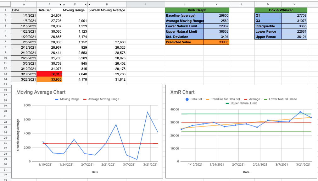
To help create your first BTO analysis, we have created a google sheet to aid you in your analysis. Click here to download your BTO analysis template. Add your data to columns A and B, and the sheet will take care of the rest. Above, you can see what a final BTO analysis looks like. For this example, we are analyzing pageviews week-over-week, from the first week of the year. Before we jump right into analyzing our data, we are going to use the next few minutes to review the 3 major sections of this sheet (The data sets, XmR chart, and the trend & outlier output boxes.)
Finding it hard to plan your marketing goals? Click here to receive your free Baseline, Trend, and Outlier Analysis Google sheet. This template will help you analyze your KPIs quickly and easily for free.
Reviewing Datasets
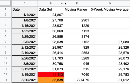
In this section, let’s look at columns A and column B. These are the actual datasets you will be filling in. Once again, in this example, we are looking at pageviews weekly. Once you fill out this section, the rest of the sheet will begin to populate. Fill in column A with the dates you would like to analyze and filling in column B the dates corresponding values. You can fill in columns A and B with as much data as you would like. The sheet formulas are built to analyze data in that entire row.
Get creative with what KPIs you choose to measure. Here is a shortlist of different KPIs we analyze on this sheet:
* Create infographic laying out 3 columns of KPIs Brand Awareness, Consideration, Conversion
Once you have collected and placed your data sets in the sheet, it is time to begin analyzing the results. Let’s take a look at columns F and G, Moving Range and 5-Week Moving Range respectively.
Moving Range
Moving Range is the difference between two successive data points. This shows you the variation of change from one value (week in our case) to another.
5-Week Moving Average
5-Week Moving Average is the average value observed across the last 5 time periods.
XmR & Moving Average Chart

XmR charts allow you to observe your data points over time while displaying the average or ‘baseline’ for that KPI. The average is then used to create the upper and lower natural limits of our datasets. The upper and lower limits (green lines) show you the ‘natural’ fluctuation of your KPI. All too often, we over-react when a KPI drops in performance. The ‘natural’ limit allows us to analyze and observe if the movement in a KPI is a part of the natural order of business. Understanding these limits is crucial to the success of your marketing campaigns.
Our moving averages chart denotes the change between two successive data points. This chart helps visualize shifts in our data and aids in understanding the natural movement between times in our business. We use this chart to get a quick baseline for the activity in our business. If observing significant peaks, we then refer to the MxR graph to see if these changes are within the ‘natural’ bounds of KPI fluctuation. This chart should be used more as a quick reference to visualize change, not analyze KPI health.
Trend & Outlier Output Boxes
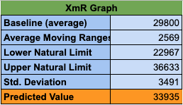
Now that we have our datasets filled out and our graphs have populated with data, it’s time to review the final section of the sheet, the trend & outlier output boxes. This output box quickly outlines the values displayed in the XmR graph for your analysis. Below are the definitions for each value:
- Baseline (average) – the central or most typical number value in the dataset
- Average Moving Range – this is the typical movement seen between each time consecutive time value
- Lower & Upper Natural Limit – is the natural range of fluctuation that a KPI can have without becoming an outlier
- Std. Deviation – a measure of the average variation that can be observed between points
- Predicted Value – this is the value that is most likely to be observed in the next time period following the trend
Knowing these types of metrics is crucial to developing and analyzing XmR graphs for your business’s needs. Now that we have a better understanding of the sheet and how we can use it to build our own BTO analysis, let’s review the 3 major insights we are looking to derive from our graph, baselines, trends, and outliers.
Side Note: the only formula you will need to change if you choose to analyze more data than the first 14 rows, is the Predicted Value in cell J7. This formula uses trend analysis to predict the next value in the data set (We will go into more detail about this a little later)
3 Major Insights (Baseline, Trend, and Outlier)
What’s a Baseline?
A baseline is a value that measures your current performance and is used for comparison purposes. You can imagine the baseline as your starting point, which you will use to compare your future results. There are tons of different methods and charts used to generate baseline metrics. Here at Well-Oiled Marketing, we kept it simple, and we use an average of past data to represent our baseline. A red line denotes the baseline in the XmR graph. We then use this baseline to detect trends in our datasets.
Trends in the Data
A trend is a pattern that can be observed in our data. When looking at XmR graphs there are 3 major trends that we should be looking for, short-run, long-run, and predictive values.
Short-Run Trend

We observe short-run trends when 3 – 4 points in our XmR graph are closer to the ‘natural’ limits than they are to the baseline. When following short-run trends, we should begin to analyze the underlying causes of this trend. If our observations continue with this pattern, they then become long-run trends. We recommend that you do not spend a large amount of effort or resources to determine the cause of this event; instead, use this as a signal for something that may need to change in the future.
Long-Run Trend

We observe long-run trends when 5 – 7 points in our XmR graph are closer to the ‘natural’ limits than they are to the baseline. Long-run trends denote a massive change in our dataset’s underlying behavior. Due to the underlying behavioral change, we must change the baseline that we are using. Go to the first data point in this trend and take the average of the points ahead of it. It is crucial to understand that this type of change in your data is significant. We should dedicate time and resources to this type of analysis. It will reap vital insights for your organization as the probability of observing this trend by chance is virtually zero.
Predictive Value
The predicted value is what we believe will be the future value for our KPI. We generate the value using the TREND function in Google Sheets, which produces a best-fitting line through the data using the least-squares method. This type of analysis is great to run when we observe long-run trends. It gives us a better idea of what the future values of the KPI would be. This is important for any marketer to know as you can trend out what the data would look like if they never implemented any marketing initiatives. You can derive the true impact of your marketing efforts when comparing the predicted value to the actual observed value. Marketers can attribute the difference to your marketing efforts. Predicted values are a really powerful tool that enables marketers to understand the future benefits their marketing could have on a KPI, all without the need for a crystal ball.
Outliers

Outliers are any datapoint that differs significantly from other data points. We can use a variety of different tests to measure outliers in our datasets. Our XmR chart shows outliers as any data point above or below the ‘natural’ limit. These observations signal an unnatural change in our KPI. If an outlier is observed in your data, try to understand what other variables could have affected the change, do not try to fix the issue. Outliers are generally one-time events that do not re-occur in our data, typically caused by outside events that we cannot control. That is why it is best to understand our datasets’ external changes rather than try to fix them.
What a journey it has been. Hopefully, now you have a better understanding of how BTO analysis allows marketers to better understand the feasibility, timing, and effort of their marketing goals through the analysis of past performance. Much of the insights derived from a BTO analysis help marketing make informed decisions about budgets and strategies that will aid in the organization’s mission to achieve a goal. If you have any comments, questions, or you are interested in learning more please reach out or leave a comment below. Well-Oiled Marketing is a group of passionate, data-driven digital marketers looking to demystify digital marketing for all.